Free Portage theme
Paper
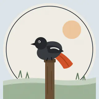
Hills drawn in ink on off-white under a red sun, kept plain so your work stands out.



What’s in Paper
A paper plane crosses the sky, stalls, dips and carries on.
- Typeface
- Instrument Serif: a tall, narrow serif that makes your name look like a magazine cover.
- Buttons
- A thin line underneath
- Corners
- Slightly rounded
- Background
- Light
The picture is your page’s banner and what people see when you share your link. Parts of it move, visitors can pause it, and it stays still for anyone with reduced motion turned on.
Like every theme, it’s a starting point. Put your own photos or video in the header, behind the page or on any button.
The colours
- Background#f4f2ee
- Cards#ffffff
- Text#1a1a18
- Muted text#5c5a55
- Accent#1a1a18
- Button text#ffffff
You can change any of them. They’re easy to read together, and the editor will tell you if a change makes text hard to read.
Contrast numbers
- Text on the background
- 15.5:1
- Muted text on the background
- 6.1:1
- Text on a card
- 17.4:1
- Button text on the accent
- 17.4:1
Body text needs at least 4.5:1, and large text and buttons need 3:1.